The visuals in gish have been something I've been thinking about for years. There were a lot of things I liked about gish 1 art wise, but even more that I didn't. My first goal when preparing art and level design ideas for gish 2 was to mentally list out all the things I felt I did wrong.
1. I didn't like the photoshopped look of the tile sets .
99% of the level tiles in gish were actually edited pictures I had taken with my digital camera. The end result wasn't horrible, but I really don't like photoshopped textures, especially ones that are just edited pictures.
2. I hated that all the levels were "inside".
Now a lot of the reason why gish 1 didn't have levels that took place outside was because it wasn't easy to design a fun level in gish that didn't have a lot of stuff to climb on and stick to, so lack of a ceiling was a bit of a problem. Other issues like outdoor lighting and my own artistic limitations made it even harder to make outdoor environments possible. It came down to the fact that there just wasn't a need for outside levels when gish is always underground..
3. I wast happy with the "tile set" look.
In the end I wish I had of made more large/multi-textured areas that would have helped mask the look of an endless wall of tiles. There isn't anything wrong with the tiled look, but there are ways around the tiled look that can break up the obvious box repetition.
So the goal of this past month was to solve those issues. Now the 1st one is easy, I'll just draw the "tiles" in the same style as the characters minus the outlines and avoid the photoshopped look all together, giving the environment a more cohesive and soft look but also letting the creatures and gish him self stand out.
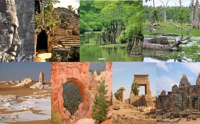
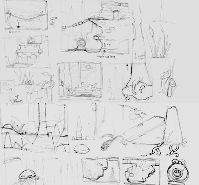
The rest of the issues took some research. The past few weeks I've spent a lot of time gathering reference pictures off flickr.com and google image search simply searching the word desert, looking for pictures with interesting visuals or land structures and pasting them into a folder. After going through the images I'll usually sketch out a few memorable level elements taken from the photos, like a unique rock formation or the way foliage and fungi grow around a fallen tree. Basically mapping out cool visuals on paper that will help the flow of level and keep the over all feel more organic.


I cant stress how important using real reference photos in art/design is. I know a lot of artists who refuse to do this and only use their "imagination" to dream up environments and other graphic elements, but really isn't your imagination just referencing things you've already seen? It's hard enough not to easily fall into video game cliche visuals in level design. Having real world references that you can pick and choose from is something that I think will give your game more life and actually inspire you more then referencing other games/making it all up yourself.
-Edmund

5 comments:
totally! having a nice big collection of reference pics is also good when you're trying to explain the style of the game to someone.
we're all about the Tadao Ando ( http://en.wikipedia.org/wiki/Tadao_Ando )
One of my art teachers was fond of saying "You are only as good as your influences." It's really true...
this will add so much to the game. will there be a snowy background as well? (not such a cliche when thinking of giant snowy & icy monsters/bosses)
Glad to see someone admitting to using reference. I'm lost without it and when I did the graphics for Head Over Heel's Blacktooth level I found a really nice cheap illustrated guide to antiques invaluable.
You've got a very distinct style. So you don't need proof that using references is a god thing. Just let your work speak for itself.
If nothing else, Gish 2 is going to look great!
Post a Comment